import pandas as pd
import numpy as np
import matplotlib.pyplot as plt
import sklearn.tree
import graphviz

#-#
import warnings
warnings.filterwarnings('ignore')plot_tree의 시각화
tree
의사결정나무의
plot_tree를 시각화해보자
해당 포스트는 전북대학교 통계학과 최규빈 교수님의 강의내용을 토대로 재구성되었음을 알립니다.
1. 라이브러리 imports
2. 데이터 적합
먼저 데이터를 트리로 적합해놓은 뒤 해당 데이터를 통해서 시각화를 해보자.
df_train = pd.read_csv('https://raw.githubusercontent.com/guebin/MP2023/main/posts/insurance.csv')
df_train| age | sex | bmi | children | smoker | region | charges | |
|---|---|---|---|---|---|---|---|
| 0 | 19 | female | 27.900 | 0 | yes | southwest | 16884.92400 |
| 1 | 18 | male | 33.770 | 1 | no | southeast | 1725.55230 |
| 2 | 28 | male | 33.000 | 3 | no | southeast | 4449.46200 |
| 3 | 33 | male | 22.705 | 0 | no | northwest | 21984.47061 |
| 4 | 32 | male | 28.880 | 0 | no | northwest | 3866.85520 |
| ... | ... | ... | ... | ... | ... | ... | ... |
| 1333 | 50 | male | 30.970 | 3 | no | northwest | 10600.54830 |
| 1334 | 18 | female | 31.920 | 0 | no | northeast | 2205.98080 |
| 1335 | 18 | female | 36.850 | 0 | no | southeast | 1629.83350 |
| 1336 | 21 | female | 25.800 | 0 | no | southwest | 2007.94500 |
| 1337 | 61 | female | 29.070 | 0 | yes | northwest | 29141.36030 |
1338 rows × 7 columns
## step 1
X = pd.get_dummies(df_train.drop('charges', axis = 1))
y = df_train['charges']

## step 2
predictr = sklearn.tree.DecisionTreeRegressor(max_depth = 3)

## step 3
predictr.fit(X, y)

## step 4 -- passDecisionTreeRegressor(max_depth=3)In a Jupyter environment, please rerun this cell to show the HTML representation or trust the notebook.
On GitHub, the HTML representation is unable to render, please try loading this page with nbviewer.org.
DecisionTreeRegressor(max_depth=3)
3. matplotlib 기반 시각화
A. plot_tree 기본 시각화
sklearn.tree.plot_tree(predictr); ## ;을 통해 계산과정 제거 가능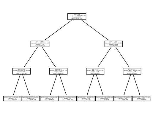
잘 안보여…
### B. max_depth 조정
sklearn.tree.plot_tree(
    predictr,
    max_depth = 0
);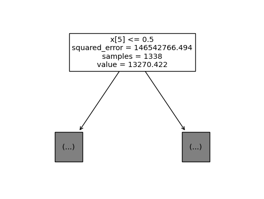
일단 보이기는 하는데, 위에 하나만 보이겠지…
C. 변수이름 추가 | feature_names = list
sklearn.tree.plot_tree(
    predictr,
    max_depth = 0,
    feature_names = X.columns.to_list()  ## 교수님은 잘 되시던데 나는 왜 리스트로 넣어야만 할까...
);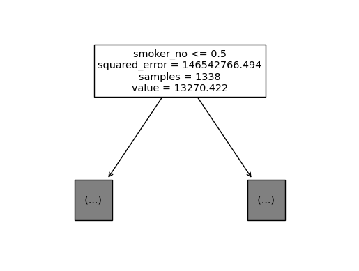
x[5]같은 식으로 순서만 표시되던 게, 이름이 표기되었다.
### D. fig 오브젝트
- plt.gcf()를 통해 fig오브젝트로 추출
sklearn.tree.plot_tree(
    predictr,
    max_depth = 1,
    feature_names = X.columns.to_list()
);

fig = plt.gcf()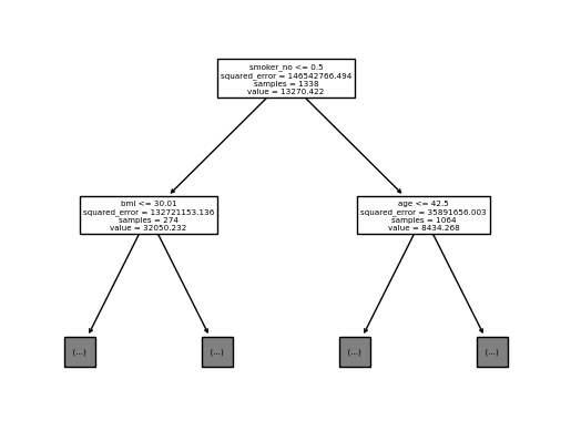
이제 이녀석은
matplotlib에서 다룰 수 있다.
fig.suptitle("Can we setting title?")Text(0.5, 0.98, 'Can we setting title?')fig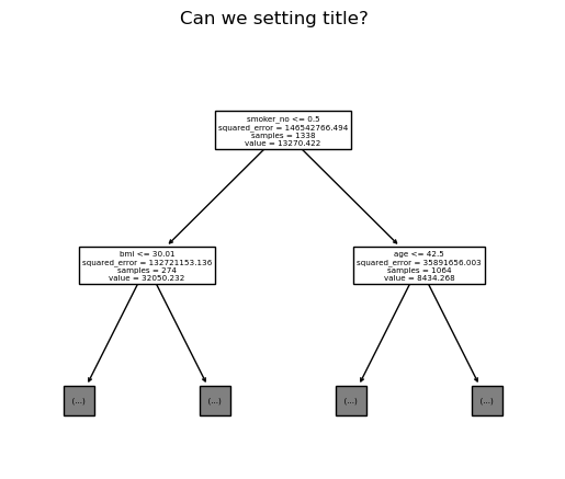
- dpi(해상도) 조정
fig.set_dpi(250)
fig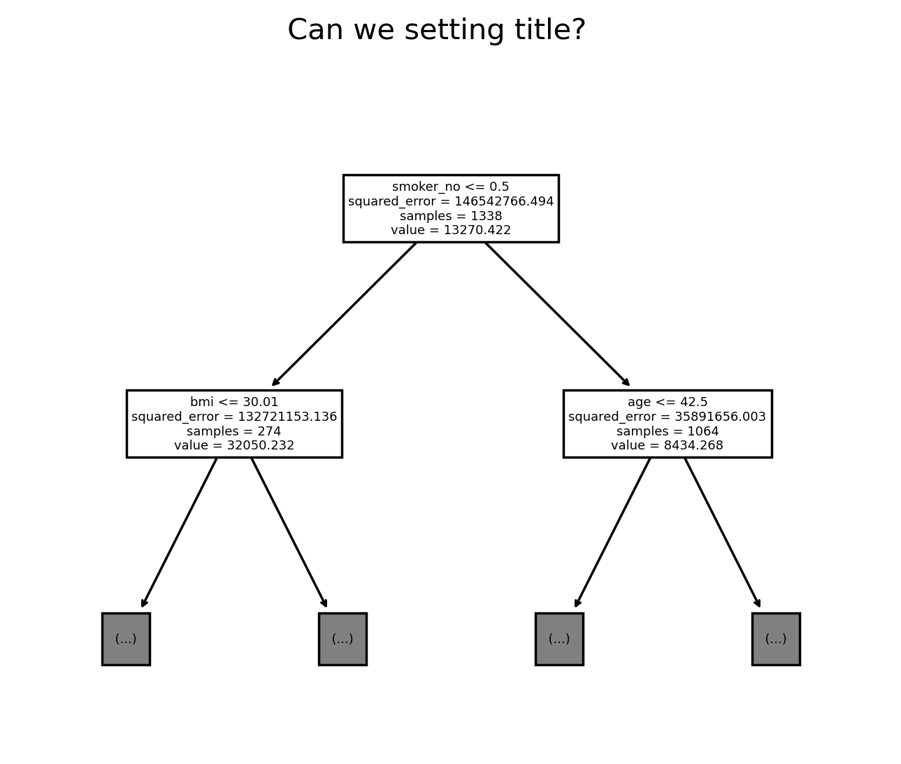
아마 해상도를 무쟈게 올리면 되기야 하겠지… 근데 그럼 사진이 엄청나게 커지겠지…
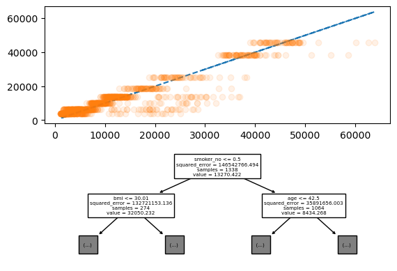
E. matplotlib의 ax에 그리기
- tree로 적합한 값의 차이 정도와 plot_tree를 위아래로 표기하기
fig = plt.figure()
ax = fig.subplots(2,1)
ax[0].plot(y, y, '--')
ax[0].plot(y, predictr.predict(X), 'o', alpha = 0.1)
sklearn.tree.plot_tree(
    predictr,
    max_depth = 1,
    feature_names = X.columns.to_list(),
    ax = ax[1]  ## 해당 옵션으로 ax에 삽입이 가능하다.
);
4. GraphViz
딱봐도 보기 불편한데, 뭔가 개선을 해놨지 않았을까???
그래서 준비했습니다!!
g = sklearn.tree.export_graphviz(
    predictr,
    feature_names = X.columns.to_list()
)
graphviz.Source(g)
위아래로 타이트하게 나오면서 스크롤로 볼 수 있게 된 모습, 애초에
sklearn에서 해당 사항을 우려해서 이렇게 만들어놓았다.
- 파일로 추출해서 저장하려면?
graphviz.Source(g).render('tree', format = 'pdf') ## 파일명, 포맷'tree.pdf'작업공간에 파일이 추가된 것을 볼 수 있다.