import numpy as np
import pandas as pd
import matplotlib.pyplot as plt
import plotly.express as px
import plotly.graph_objects as go
import plotly.io as pioPlotly | 그래픽 오브젝트
plotly
plotly를 더 완벽하게 활용해보자.
1. 라이브러리 imports
pd.options.plotting.backend = "plotly"
pio.templates.default = "plotly_white"
2. Intro
A. 대체 어떻게 저런 코드를 알아내는 거임???
지난 시간 강의노트에서…
df_sample = pd.DataFrame(
    {'path':['A','A','B','B','B'],
     'lon':[-73.986420,-73.995300,-73.975922,-73.988922,-73.962654],
     'lat':[40.756569,40.740059,40.754192,40.762859,40.772449]}
)
fig = px.line_mapbox(
    data_frame=df_sample,
    lat = 'lat',
    lon = 'lon',
    color = 'path',
    line_group = 'path',
    #---#
    mapbox_style = 'carto-positron',
    zoom=12,
    width = 750,
    height = 600
)
scatter_data = px.scatter_mapbox(
    data_frame=df_sample,
    lat = 'lat',
    lon = 'lon',
    color = 'path',
    #---#
    mapbox_style = 'carto-positron',
    zoom=12,
    width = 750,
    height = 600
).data
fig.add_trace(scatter_data[0])
fig.add_trace(scatter_data[1])
fig.show(config={'scrollZoom':False})data라던가, add_trace라던가, show 안에 들어가 있는 옵션이라던가…
도대체 이런 코드들은 어떻게 알아내는 걸까?
### B. 심슨의 역설 데이터
- 아래의 자료를 사용해서 plotly를 뜯어보자.
df = pd.read_csv("https://raw.githubusercontent.com/guebin/DV2022/master/posts/Simpson.csv",index_col=0,header=[0,1]).reset_index().melt(id_vars='index').set_axis(['department','gender','result','count'],axis=1)
df.head()| department | gender | result | count | |
|---|---|---|---|---|
| 0 | A | male | fail | 314 |
| 1 | B | male | fail | 208 |
| 2 | C | male | fail | 204 |
| 3 | D | male | fail | 279 |
| 4 | E | male | fail | 137 |
C. plotly의 시각화 구조
plotly로 시각화하는 대표적인 방법 몇을 리뷰해보자.
# 예시 1 pandas backend : 가장 쉬운 방법
df.pivot_table(index='gender',columns='result',values='count',aggfunc='sum')\
.assign(rate = lambda df:  df['pass']/(df['fail']+df['pass']))\
.assign(rate = lambda df:  np.round(df['rate'],2))\
.loc[:,'rate'].reset_index()\
.plot.bar(
    x='gender', y='rate',
    color='gender',
    text='rate',
    #---# 상단 : geom 관련 부분, 하단 : 세부 옵션 부분
    title='버클리대학교의 남녀합격률',
    width=600
)
# 예시 2 px.bar를 이용한 plot(ggplot을 사용하는 것과 유사하다.)
tidydata = df.pivot_table(index='gender',columns='result',values='count',aggfunc='sum')\
.assign(rate = lambda df:  df['pass']/(df['fail']+df['pass']))\
.assign(rate = lambda df:  np.round(df['rate'],2))\
.loc[:,'rate'].reset_index()
#---#
px.bar(
    tidydata,
    x = 'gender', y = 'rate',
    color='gender',
    text='rate',
    #---#
    title='버클리대학교의 남녀합격률',
    width=600
)
# 예시 3 px.bar를 이용한 플랏 1 (pandas Series를 입력) - 여기부턴 그 결과가 조금 다름
tidydata = df.pivot_table(index='gender',columns='result',values='count',aggfunc='sum')\
.assign(rate = lambda df:  df['pass']/(df['fail']+df['pass']))\
.assign(rate = lambda df:  np.round(df['rate'],2))\
.loc[:,'rate'].reset_index()
#---#
px.bar(
    x = tidydata.gender, y = tidydata.rate,  ## 시리즈를 넣어줘버림
    color = tidydata.gender,
    text = tidydata.rate,
    #---#
    title = '버클리대학교의 남녀 합격률',
    width = 600
)
legend가color로 바뀌고,axis의 레이블이x,y로 바뀌었다. 시리즈의 열 인덱스 정보가 날아간 모습
# 예시 4 px.bar를 이용한 플랏 2 (list를 입력) - 위에꺼랑 똑같음. 이젠 타이디데이터도 필요없는 모습…
list(tidydata.gender), list(tidydata.rate)(['female', 'male'], [0.42, 0.52])px.bar(
x = ['female', 'male'], y = [0.42, 0.52], ## 시리즈도 깨고 리스트를 먹여버림
color = ['female', 'male'],
text = [0.42, 0.52],
#---#
title = '버클리대학교의 남녀 합격률',
width = 600
)# 예시 5 go를 이용한 시각화 - 색상 시각화가 불가능 (완전 ggplot() + geom_col() 느낌)
fig = go.Figure()  ## plt.figure()와 유사
fig
bar = go.Bar(
x = ['female','male'], y = [0.42,0.52]
)
layout = {'title':'버클리대학교의 남녀합격률','width':600}
fig.add_trace(bar).update_layout(layout) ## mapbox에 추가하는 것과 동일한 메소드, fig에 ax를 추가하는 느낌이랄까?fig.data(Bar({
'x': ['female', 'male'], 'y': [0.42, 0.52]
}),)애초에 두 개가 하나로 묶여있어서 색상을 다르게 그릴 수가 없음…
# 예시 6 go를 이용한 시각화 - matplotlib의 겹쳐그리기 감성 구현(\(\star\))
plt.plot([1,2,3],[3,4,1],label='A')
plt.plot([1,2,3],[2,5,2],label='B')
plt.legend()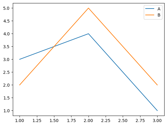
이런 옛날 방식이 있었다… 이걸 응용하면…
plt.bar('female', 0.42, label = 'female')  ## 아예 리스트도 없이 쌩으로 넣어버림
plt.bar('male', 0.52, label = 'male')
plt.legend()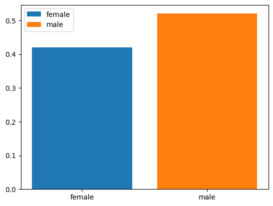
plt.show()를 하기 전 계속해서 겹쳐 그리며 색상이 나뉘어졌다. 이것에서 힌트를 얻으면…!
fig = go.Figure()
bar_female = go.Bar(
    x = ['female'], y = [0.42],
    name = 'female',
    text = [0.42]
)
bar_male = go.Bar(
    x = ['male'], y = [0.52],
    name = 'male',
    text = [0.52]
)
layout = {'title' : '버클리대학교의 남녀 합격률', 'width' : 600}
fig.add_trace(bar_female).add_trace(bar_male).update_layout(layout)
# 예시 7 go를 이용한 시각화 - 색상의 변경(남자는 파랑, 여자는 빨강으로?)
fig = go.Figure()
bar_female = go.Bar(
    x = ['female'], y = [0.42],
    name = 'female',
    text = [0.42],
    marker = {'color':'red'}
)  ## matplotlib에서 각 plot에 color를 지정해주는 것과 유사하다.
bar_male = go.Bar(
    x = ['male'], y = [0.52],
    name = 'male',
    text = [0.52],
    marker = {'color':'blue'}
)
layout = {'title':'버클리대학교의 남녀합격률','width':600}
fig.add_trace(bar_female).add_trace(bar_male)\
.update_layout(layout)
뭔가 맘에 안듦. 데이터 뜨는 것부터 색상, 인덱스 등 다 맘에 안듦.
# 예시 8 go를 이용한 시각화 - 색상 재설정 + \(x\)축, \(y\)축, legend의 title 설정 + hover 설정
- 색상설정 :
#EF553B,#636efa hovertemplate:'gender=%{x}<br>rate=%{text}<extra></extra>'
fig = go.Figure()
bar_female = go.Bar(
    x = ['female'], y = [0.42],
    name = 'female',    ## default는 trace_num
    text = [0.42],
    marker = {'color':'#EF553B'},   ## marker를 딕셔너리로 설정해줌
    hovertemplate = 'gender=%{x}<br>rate=%{text}<extra></extra>'    ## 뭘 띄울 것인지, html문법 사용?
)
bar_male = go.Bar(
    x = ['male'], y = [0.52],
    name = 'male',
    text = [0.52],
    marker = {'color':'#636efa'},
    hovertemplate = 'gender=%{x}<br>rate=%{text}<extra></extra>'
)
layout = {
    'title':'버클리대학교의 남녀합격률',
    'width':600,
    'legend':{'title':'gender'},
    'xaxis':{'title':'gender'},
    'yaxis':{'title':'rate'}
}
fig.add_trace(bar_female).add_trace(bar_male)\
.update_layout(layout)
색상정보 #EF553B 이런 거 어떻게 알 수 있음??
fig = df.pivot_table(index='gender',columns='result',values='count',aggfunc='sum')\
.assign(rate = lambda df:  df['pass']/(df['fail']+df['pass']))\
.assign(rate = lambda df:  np.round(df['rate'],2))\
.loc[:,'rate'].reset_index()\
.plot.bar(
    x='gender', y='rate',
    color='gender',
    text='rate',
    title='버클리대학교의 남녀합격률',
    width=600
)
fig.data  ## 매우매우매우매우매우매우 중요
(Bar({
'alignmentgroup': 'True',
'hovertemplate': 'gender=%{x}<br>rate=%{text}<extra></extra>',
'legendgroup': 'female',
'marker': {'color': '#636efa', 'pattern': {'shape': ''}},
'name': 'female',
'offsetgroup': 'female',
'orientation': 'v',
'showlegend': True,
'text': array([0.42]),
'textposition': 'auto',
'x': array(['female'], dtype=object),
'xaxis': 'x',
'y': array([0.42]),
'yaxis': 'y'
}),
Bar({
'alignmentgroup': 'True',
'hovertemplate': 'gender=%{x}<br>rate=%{text}<extra></extra>',
'legendgroup': 'male',
'marker': {'color': '#EF553B', 'pattern': {'shape': ''}},
'name': 'male',
'offsetgroup': 'male',
'orientation': 'v',
'showlegend': True,
'text': array([0.52]),
'textposition': 'auto',
'x': array(['male'], dtype=object),
'xaxis': 'x',
'y': array([0.52]),
'yaxis': 'y'
}))뒤에 data를 붙여서 개체를 뽑아먹을 수 있음. 여기서 들어가있는 값들을 적당히 따온 것…
### D. px vs go
- go는 핸드메이드 제품을, px는 양산품을 만든다고 이해하면 편리함.
go의 특징 : 유저의 자유도가 매우 높음. 그림의 크기, 색상 등을 선호에 맞게 조정하기 유리. but, 생산성이 낮음px의 특징 : 유저의 자유도가 낮음. 원하는 그림을 빠르게 생산할 수 있음. but, 내가 원하는 디자인이 나오지 않을 수 있음.
- 그래서 뭘 쓰라고?
px를 쓰는 게 좋다.- 그런데
go를 이용하여 그림이 그려지는 원리를 이해하면 이후에px를 이용한 그림을 수정하기 용이하다.
전략 : px로 그림을 그린다 + go로 수정한다.
3. pio를 이용한 시각화
A. 함수의 입력(예비학습)
# 예제 1 두 벡터 x, y가 주어졌을 때, R에서 cbind와 같은 역할을 하는 함수를 구현하라.
def cbind(x, y) :
return np.stack([x, y], axis = 1)cbind([1,2,3],[3,4,5])array([[1, 3],
[2, 4],
[3, 5]])# 예제 2 세 개 이상의 벡터가 오도록 하려면?
*args를 이용하여 이후 입력을 받음
def _cbind(x, y, *args) :
  ## args의 정체
  print(args)
rslt = np.stack([x, y], axis = 1)_cbind([1,1],[2,2],[3,3],[4,4]) ## <- args.([3, 3], [4, 4])
*args는 함수 내에서 추가 인자를 튜플로 받아놓는다.
def cbind(x, *args) :
  rslt = np.stack([x] + list(args), axis = 1)  ## 합할 수 있게 튜플을 리스트로 변환한 후 더해주었음(이중 리스트)
return rsltcbind([1,2,3], [2,3,4], [3,4,5], [4,5,6])array([[1, 2, 3, 4],
[2, 3, 4, 5],
[3, 4, 5, 6]])# 예제 3 기본적으로 cbind의 동작을 하지만, 경우에 따라서 rbind처럼 동작하길 원한다면?
axis라는 변수를 따로 생성하여 입력으로 처리, 기본값은 1
def bind(x, y, *args, axis = 1) :
  rslt = np.stack([x, y] + list(args), axis = axis)
return rsltdisplay(bind([1,1,1], [2,2,2], [3,3,3], [4,4,4], axis = 0))
display(bind([1,1,1], [2,2,2], [3,3,3], [4,4,4]))array([[1, 1, 1],
[2, 2, 2],
[3, 3, 3],
[4, 4, 4]])array([[1, 2, 3, 4],
[1, 2, 3, 4],
[1, 2, 3, 4]])# 예제 4 여러가지 추가 옵션을 사용하여 print를 통제하고 싶다면?
def _bind(x, y, *args, axis = 1, **kwarg) :
  print(kwarg)
  rslt = np.stack([x, y] + list(args), axis = axis)
return rslt_bind([1,1,1], [2,2,2], verbose1 = True, verbose2 = True, verbose3 = True, verbose4 = True) ## verbose : 상세한 로그 출력 여부(지금은 그냥 더미로 넣은 것){'verbose1': True, 'verbose2': True, 'verbose3': True, 'verbose4': True}array([[1, 2],
[1, 2],
[1, 2]])
**kwarg는 인풋값을 딕셔너리 형태로 받아놓는다.
def bind(x, y, *args, axis = 1, **kwargs) :
  if ('vb1' in kwargs) and kwargs['vb1'] :
    print(f'위치인자 arguments : {x, y}')

  if ('vb2' in kwargs) and kwargs['vb2'] :
    print(f'가변위치인자 : {args}')

  if ('vb3' in kwargs) and kwargs['vb3'] :
        print(f'키워드인자: {axis}')

  if ('vb4' in kwargs) and kwargs['vb4'] :
        print(f'가변키워드인자: {kwargs}')

  rslt = np.stack([x,y]+list(args),axis=axis)
return rsltbind([1,1,1], [2,2,2], vb2 = True)가변위치인자 : ()array([[1, 2],
[1, 2],
[1, 2]])아직
args를 아무것도 입력하지 않았으므로 아무것도 없다
bind([1,1,1],[2,2,2],[3,3,3],
     vb1=True,vb2=True,vb3=True,vb4=True)
위치인자 arguments : ([1, 1, 1], [2, 2, 2])
가변위치인자 : ([3, 3, 3],)
키워드인자: 1
가변키워드인자: {'vb1': True, 'vb2': True, 'vb3': True, 'vb4': True}array([[1, 2, 3],
[1, 2, 3],
[1, 2, 3]])- 기본적으로 들어가야 하는 인자들
x,y: 위치인자 - 추가적으로 입력될 수 있는 인자들
args: 가변위치인자 - 디폴트 값이 지정된 키워드 인자들
axis: 키워드인자 - 추가적으로 넣어줄 수 있는 키워드 인자들
kwargs: 가변키워드인자
# 예제 5 위치인자를 키워드인자보다 뒤에 넣을 경우?
bind(axis = 0, [1,2,3], [2,3,4])SyntaxError: ignoredpositional argument(위치인자) 뒤에 keywork argument(키워드인자)가 들어가 있어야 함, 서순 필수
bind(axis = 0, x = [1,2,3], y = [2,3,4])array([[1, 2, 3],
[2, 3, 4]])물론 따로 위치인자를 직접 지정해줄 경우 오류가 나지 않음
# 예제 6 키워드인자의 키를 잘못 입력한 경우?
bind([1,2,3], [2,3,4], ax = 0)array([[1, 2],
[2, 3],
[3, 4]])bind([1,2,3],[2,3,4], verbose = True)array([[1, 2],
[2, 3],
[3, 4]])bind([1,2,3],[2,3,4], qwerasdf1234zzz = True)array([[1, 2],
[2, 3],
[3, 4]])하지만 아무 일도 일어나지 않았다!(어차피
kwargs에 들어가는 건 똑같지만, 뭐 그것 가지고 내부 기믹에서 뭘 하는 게 따로 있는 건 아니니 상관없다.)
bind([1,2,3],[2,3,4],axis=3)AxisError: axis 3 is out of bounds for array of dimension 2이건 문제가 있음(인자는 제대로 입력했지만 그 값을 잘못 넣은 경우…)
- 요약
- 함수의 입력은 꽤 복잡한 방식으로 동작한다.
- 위치인자의 위치를 잘못 넣으면 동작하지 않는다.
- 가변키워드인자의 키를 다른 이름으로 넣으면 에러는 나지 않는다.(그냥 무시)
# 예제 7 은근히 짜증났던 plt.plot()
plt.plot([1,2,3,4], [2,3,4,2], 'r--')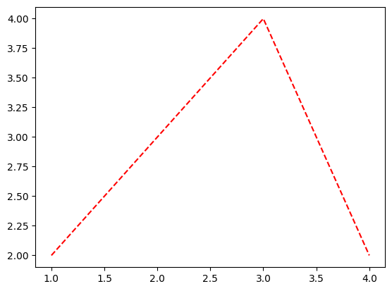
plt.plot([1,2,3,4],[2,3,4,2],color='lime','--') ## 키워드 인자 뒤에 위치인자가 들어간 상황!!SyntaxError: ignoredplt.plot([1,2,3,4],[2,3,4,2],'--',color='lime')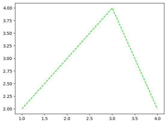
이렇게 순서대로 해야 제대로 산출이 된다.
### B. dictionary + pio.show()
# 예제 1 dictionary + pio.show()
fig = dict()
fig['data'] = [
    {"type": "bar", "x": ['female'], "y": [0.42]},
    {"type": "bar", "x": ['male'], "y": [0.52]}
]  ## 리스트를 딕셔너리 밸류로 넣음
fig['layout'] = {
    "title": {"text": "Title"},
    "width": 600
} ## 딕셔너리를 딕셔너리 밸류로 넣음fig{'data': [{'type': 'bar', 'x': ['female'], 'y': [0.42]},
{'type': 'bar', 'x': ['male'], 'y': [0.52]}],
'layout': {'title': {'text': 'Title'}, 'width': 600}}해당 딕셔너리를 바로 이용하면…
pio.show(fig)마치
pio.show()에 필요한kwargs를fig라는 이름의 dict로 전달하는 느낌…!
pio.show(dict()) ## 빈 딕셔너리 전달...핵심 요약 : fig의 본질은 dictionary이며, 이는 pio.show()에 전달할 kwargs를 모아놓은 집합이다.
# 예제 2 female의 rate(y)를 0.62로 수정
fig['data'][0]['y'] = [0.62]
fig
{'data': [{'x': ['female'], 'y': [0.62], 'type': 'bar'},
{'x': ['male'], 'y': [0.52], 'type': 'bar'}],
'layout': {'title': {'text': 'Title'}, 'width': 600}}pio.show(fig)# 예제 3 fig에 정리된 args들이 전부는 아님…!
fig['data'][0]['marker'] = {'color' : '#636efa'}  ## 디폴트 값들
fig['data'][1]['marker'] = {'color':'#EF553B'}
fig
{'data': [{'x': ['female'],
'y': [0.62],
'type': 'bar',
'marker': {'color': '#636efa'}},
{'x': ['male'], 'y': [0.52], 'type': 'bar', 'marker': {'color': '#EF553B'}}],
'layout': {'title': {'text': 'Title'}, 'width': 600},
'legend': 'gender'}pio.show(fig)디폴트 값이 입력된 것이라 딱히 달라지진 않는다…(입력하지 않아도 되는 키워드 인자)
4. go를 이용한 시각화
A. pio와 go의 연결
fig = dict()
fig['data'] = [
    {"type": "bar", "x": ['female'], "y": [0.42]},
    {"type": "bar", "x": ['male'], "y": [0.52]}
]
fig['layout'] = {
    "title": {"text": "Title"},
    "width": 600
}  ## update_layout의 근원
pio.show(fig)
위의 코드와 동일한 효과를 주는 코드들을 알아보자.
# 예제 1 data의 원소를 dict로 정리하여 추가(append())
fig = dict()
fig['data'] = list()
bar_female = {'type':'bar', "x": ['female'], "y": [0.42]}
bar_male = {'type':'bar', "x": ['male'], "y": [0.52]}
fig['data'].append(bar_female)  ## data는 딕셔너리의 리스트였다. 바 플롯 개체를 직접 추가해주는 모습
fig['data'].append(bar_male)
fig['layout'] = {
    "title": {"text": "Title"},
    "width": 600
}
pio.show(fig)
# 예제 2 go.Bar()를 이용
go.Bar({"x": ['female'], "y": [0.42]})Bar({
'x': ['female'], 'y': [0.42]
})fig = dict()
fig['data'] = list()
bar_female = go.Bar({"x": ['female'], "y": [0.42]}) ## 딕셔너리와 동일한 역할을 한다. 'type' : 'bar'라는 키워드인자가 포함되어 있다.
bar_male = go.Bar({"x": ['male'], "y": [0.52]}) ## 타입을 쓰지 않는 딕셔너리와 똑같다고 보면 됩니다...!!!
fig['data'].append(bar_female)
fig['data'].append(bar_male)
fig['layout'] = {
"title": {"text": "Title"},
"width": 600
}
pio.show(fig)# 예제 3 go.Bar() + go.Figure() + add_trace()를 이용
fig = go.Figure()  ## 딕셔너리 대신 피규어를 이용한다. 이쪽이 정석이긴 하다.
bar_female = go.Bar({"x": ['female'], "y": [0.42]})
bar_male = go.Bar({"x": ['male'], "y": [0.52]})
fig.add_trace(bar_female)   ## figure에 플랏(trace)을 추가, fig['data'].append(bar_female)와 동일
fig.add_trace(bar_male)
fig['layout'] = {
    "title": {"text": "Title"},
    "width": 600
}
#fig.show()
fig
display(fig.data)
display(fig.layout)(Bar({
'x': ['female'], 'y': [0.42]
}),
Bar({
'x': ['male'], 'y': [0.52]
}))Layout({
'template': '...', 'title': {'text': 'Title'}, 'width': 600
})go.Bar()를 아래와 같이 사용할 수도 있다.
# go.Bar({"x": ['female'], "y": [0.42]})
# go.Bar(dict(x=['female'],y=[0.42]))
go.Bar(x=['female'],y=[0.42])  ## 딕셔너리를 넣지 않고 위치인자를 통해 직접 넣을 수도 있음
Bar({
'x': ['female'], 'y': [0.42]
})딕셔너리나 go.Bar()나 어떻게 입력하든 상당히 호환이 잘 된다
사실 아래와 같이 go.Figure()만 이용하고, go.Bar()는 사용하지 않아도 무방함(수틀리면…)
fig = go.Figure()
bar_female = {'type':'bar', "x": ['female'], "y": [0.42]}  ## 위에서 둘이 똑같다고 했으니까...!
bar_male = {'type':'bar', "x": ['male'], "y": [0.52]}
fig.add_trace(bar_female)
fig.add_trace(bar_male)
fig['layout'] = {
    "title": {"text": "Title"},
    "width": 600
}
#fig.show()
fig
# 예제 5 go.Bar() + go.Figure() + add_trace() + update_layout()
fig = go.Figure()
bar_female = go.Bar(x=['female'], y= [0.42])
bar_male = go.Bar(x=['male'], y= [0.52])
fig.add_trace(bar_female)  ## 각 개체를 피규어에 추가한다. mapbox 계열에서 사용했던 적이 있었지...
fig.add_trace(bar_male)
fig.update_layout(
    {"title": {"text": "Title"},
    "width": 600}
)
fig
사실
layout을 딕셔너리로 지정하지 않고 위치인자로 지정해도 된다. (go.Bar()와 동일한 매커니즘)
fig = go.Figure()
bar_female = go.Bar(x=['female'], y= [0.42])
bar_male = go.Bar(x=['male'], y= [0.52])
fig.add_trace(bar_female)
fig.add_trace(bar_male)
fig.update_layout(
    title = {"text": "Title"},
    width = 600
)
fig
# 예제 6 go.Bar() + go.Figure() + add_traces() + update_layout()
fig = go.Figure()
bar_female = go.Bar(x=['female'], y= [0.42])
bar_male = go.Bar(x=['male'], y= [0.52])
fig.add_traces([bar_female,bar_male])  ## 리스트로 묶거나, for문을 통해 한번에 업데이트 할 수도 있다.
fig.update_layout(
    {"title": {"text": "Title"},
    "width": 600}
)
fig
### B. go를 이용하는 공식적인 추천포맷
## step 1 : create figure
fig = go.Figure()

## step 2 : add some traces
fig.add_traces(
    [go.Bar(x=['female'], y= [0.42]),
     go.Bar(x=['male'], y= [0.52])]
)

## step 3 : update options
fig.update_layout(
    title = "버클리대학교 성별합격률",
    width = 600,
    legend = {'title':'gender'}
)

## step 4 : show
fig.show()
- go.Figure()로 피규어를 생성하고, fig.add_traces()에 리스트로 go.Bar()를 이용하여 개체를 넣어준 뒤, fig.update_layout()에 위치인자를 지정하여 옵션을 부여한다!